Season 13
Episode 2: Unconventional Movie Nite
I mainly blog on my commentary on the Runway Challenge designs, judges critiques and of other matters I take notice, not so much recapping the episode or all the drama…
*Spoiler Alert*
The Episode title pretty much gave away the challenge of this episode. The designers were brought to a nearby movie theater (where they did not watch a movie, mind you) to watch a lame 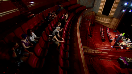 video clip with a cheesy deep-voiced narrator which seems like a promo for Project Runway that did not make the c
ut… that fades to Tim Gunn! Tim announces that the Challenge is to create a look that incorporates your movie experience AND using unconventional materials which are movie and movie experience items (Camera, Lighting, Art Props, Costume and Wardrobe department items etc.) in addition of items from the theater’s concession stand. TWIST: WELL, since Episode 1 was ridiculously simply, let’s put addition pressure and stress on using conventional materials by making this a TEAM CHALLENGE as well! Hey, it isn’t the toughest of challenges on Project Runway history. Toughen up, season 13!
So, there are 5 teams of 3 designers, each expected to create a 3-Piece Mini Collection of cohesive designs made of unconventional materials. The 5 teams are:
Red Team: Sandhya, Hernan, Carrie
Silver Team: Amanda, Kristine, Korina
Green Team: Samantha, Emily, Alexander
Blue Team: Angela, Fade, Sean
Purple Team: Charketa, Mitchell, Kini
Let’s skip the drama because I am not all for the drama here (should you wish to, follow me on twitter! I live tweet #ProjectRunway #PR13), on to the RUNWAY!
Today’s Guest Judge is French Fashion Blogger: Garance Doré
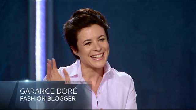
If you don’t know who she is, she is quite the powerhouse: A French photographer, illustrator and author who is also well-known for her Fashion blog.
And it seems that Heidi has chosen yet another all-black ensemble for today’s runway show:
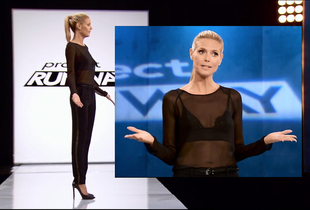
Love it or hate it? I personally love the trousers, however not too sure of the translucent top… It is quite alright but does it really go with that particular bra? I think one with a thinner horizontal strap-buckle would make a difference.
*The Words under each designers name are the first few words that pop in my mind when I first see the design down the runway.
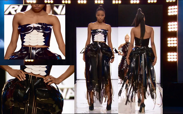
RED TEAM
Sandhya: 3/10
Wearable, Adorable, Disjointed
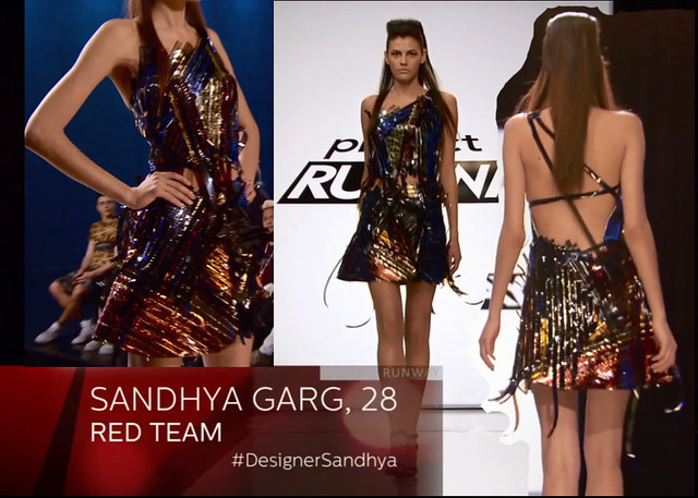
- The proportions may be a slight bit off but overall, an adorable look. The stray flim strips gives it a airy bounce and edge, but I CANNOT WRAP MY HEAD around that chopped of pieces at the waist! In words of Jerry Espenson of Boston Legal “Yuck, Yuck, YUCK!”
- The mesh of colors and sheen is refreshing
Carrie: 3.5/10
Hollywood Glam – Too literally? Average, Cute, Poor Execution
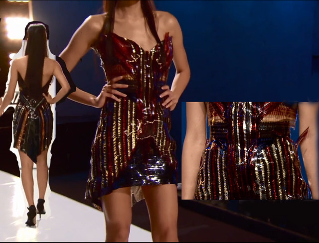
- -Nothing special, nothing wrong with it as well. Basic silhouette, no wow factor or special design to it… the use of Red, blue and gold striping together is giving me a very American patriotic vibe.
- Appreciate the strands on the top, gives it a fiery and free feel
- Absolutely horrendous execution
Hernan: 3.5/10
Rigid Shell, Unflattering, Hard
- A bit more of strong warrior princess feel than Hollywood glam with the thick collar neck line which I do not think is working here (Almost Heavy and choking).
- Perhaps a stronger, modern woman style, confident.
=Definitely cohesive with the same use of technique and materials. It would all appeal to the same girl I must say: Strong, confident which is not afraid of showing her sexiness but it is bottom line the same fabric in different silhouettes
=10/30
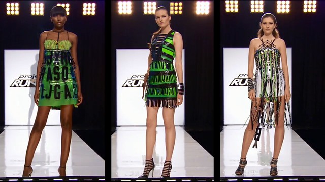
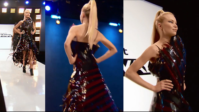
SILVER TEAM
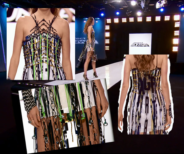
Kristine: 8/10
Youthful, Bold and Statement Making, Unique, Creative & Inventive, Raw
- I can definitely appreciate the creativity with the word paneling and braiding however… is there a purpose with the lettering? or just at random -who knows, judges might just say it looks like a shower curtain
- The black strip at the back is certainly off putting, feels unfinished, slapping it on just to cover it at the last minute or due to lack of materials
- Overall, I absolutely adore this fresh and raw look.
Korina: 6.5/10
Bugs, Comic, Superhero, Animation, Bold, Sexy
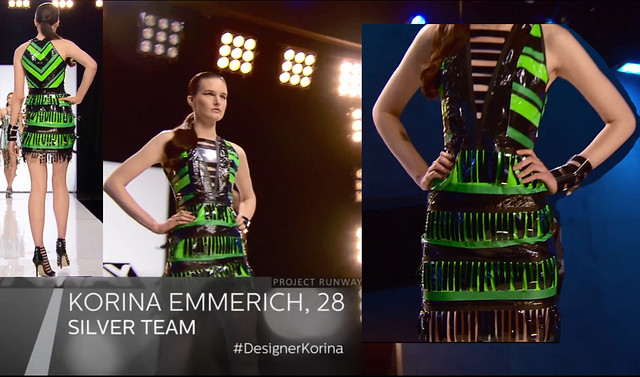
- Yes, the first word was BUG. It reminded me of a caterpillar or sorts. Do not necessarily hate it… but don’t love it either.
- Very graphic. It is on the fine line of being very costume-superhero and young-bold-graphic chic. To me, it found just about escaped with being a wearable chic bodycon. The color together or perhaps the sheen of the duct tape makes it look a tad cheap to me however.
- Love the plastic cuff,I would like to have that
Amanda: 8/10
Cool, Flows, Accentuates, Creative, Innovative
- Cool and sexy in a very settle way.
- The neckline is just brilliant, bold and accentuates.
- Again, LOVE the cuff piece
- It looks extremely unfinished, could potentially look MUCH better with more materials added (vertically) instead of having so little all dangling about.
- Very graphic, like a cool warrior fairy princess in the modern technology era
=I admire the humor, charm and fantasy quality to it. To me, overall as a collection, it all found a perfect balance between comic-graphic and wearable. Cohesive and possibly the most inventive team I must say.
=22.5/30
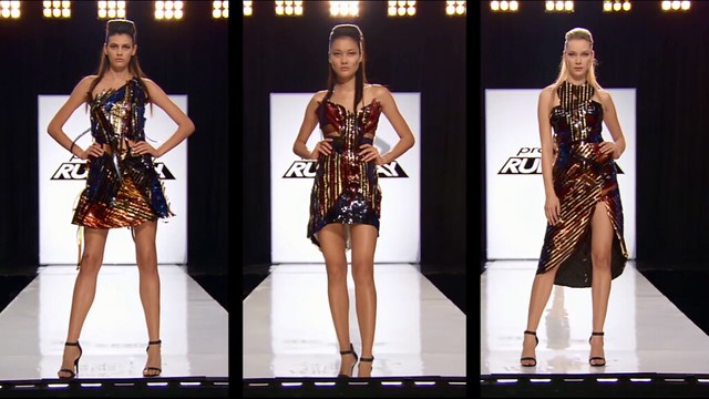
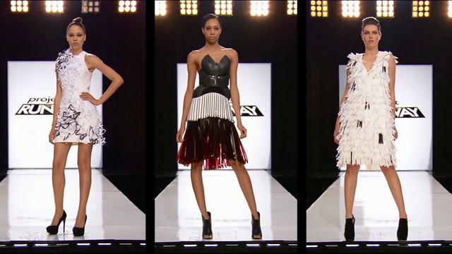
GREEN TEAM
Samantha: 8.5/10
Flirty, Unique, Good Contrast
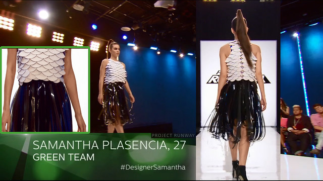
- The contrast of the hard top with a light and airy bottom is genius, and having it white and black just makes it all the more fabulous.
- Flirty touch as when the model walks in it, hints of blue strips pops up, lovely movement.
- Excellent execution
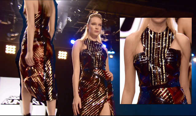
Emily: 5.5/10
Structured, Badass, Christian Siriano Fierce
- Who would’ve thought that the big hips would not be as unflattering as I thought? uhh, me? This is not the first time ballooned up hip action is presented on a silhouette (referential to Christian Siriano? I could be off, but no matter in reference to who, this silhouette is something I’ve definitely seen before)
- The scaling and play of materials on the top, way of arrangement presents a skeletal and raw mid-section. The bottom definitely escalates the drama but not too much that it seems forced.
- Not the best execution in fit (the waist) and the balloon hips aren’t balanced (or is it just me?), and the film strips at the bottom just look like a mess.
- This edgy modern biker chic routine is not the most refreshing to me on the other hand, but judging by the design alone, it is a solid look.
Alexander: 7/10
Flounce, Trendy, Pow Wow
- The way the skirt swished as the model halted to pose at the end of the runway demonstrated that although seemingly structured and rigid, this outfit is still able to have beautiful movement to it. However, the design and rigid structure almost resembles a shell… not sure if I am really into it.
- The strayed film strips at the bottom and top gives it airy-ness.
- However, questioning if the top has too much volume that is unflattering.
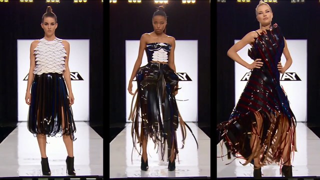
=Cohesive and nice balance of structure and ease, not the most creative or inventive sadly.
=21/30
BLUE TEAM
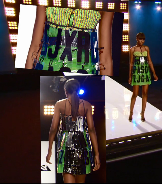
Angela: 6/10
Modern Art, Wilted, Sad, Simple, Art Project
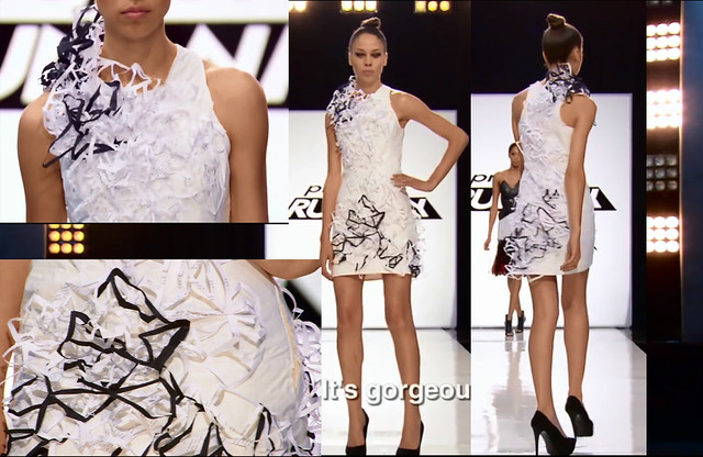
- Soft but structured, the angles the paper pieces gives it a modern edge, pop artfulness yet an ease and femininity cause of it’s lightness.
- The execution… the paper looks deflated and wilted. Almost looks… sad.
- Borderline arts and craft could be better and could be worse. Simple and pleasing, could have easily looked like a hot glue mess. However, I appreciate the overall look and aesthetic,
- Closer inspection, the little details of wordings from the script gives it that artsy touch, a statement making work of art (if that was her intention), still not very inventive and a bit too plain.
Fade 9.5/10
Good Weird, Unique, Intriguing, Futuristic
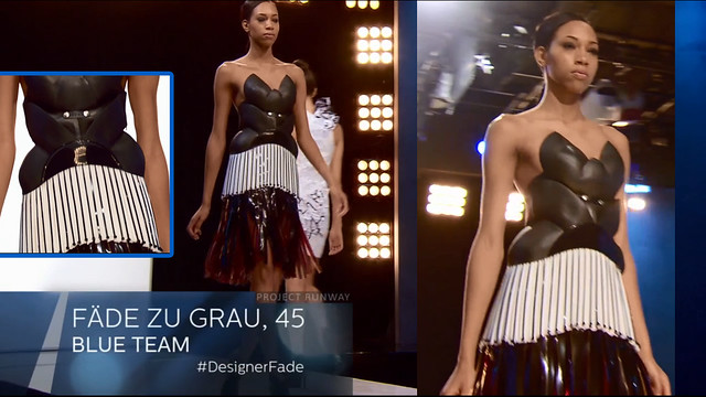
- The fit and structure with oddly interesting shape on the top somehow works with the playfulness at the bottom! Many elements to this design that somehow merge and gives an overall very high end look.
- WHAT is the material on the top? The gloss to it makes it look like leather, and looks absoutely stunning with the bottom sheen from the white material and film strips.
Sean: 8.5/10
Luxe, Intriguing, Rich Texture
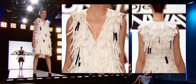
- The execution of the straws… by golly gives it such a nice rich texture which is light at the same time.
- The black notes is probably intentional for the Cruella-inspiration, but it is to me, adding a taint to the pure and innocent
- Yes, the cold hearted rich bitch would certainly sport this look albeit it not being fur
=Electric Girl, Darth Vader, Cruella. Definitely the theme of tainted innocence, the pure and good being tempted into the dark side, the make up helped convey this.
=24/30
Purple Team
Mitchell: 8/10
Psychedelic, Disco, Fun, Bubblegum, Kaleidoscope
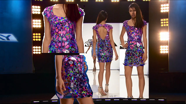
- Well Mitchell, you DO appeal to the “Girls who wanna have fu-un.”
- Fun and bright dress, definitely an outfit that will stop the presses, a lovely mesh and good use of materials, innovative.
- The way the light hits the CDs gives that even more fun and flirty appeal.
- It’s almost like looking into a looking Kaleidoscope, magnificent and stunning.
Charketa: 7/10
Funky, Shiny, Colorful, Young
- The CD/Sequin dots all over the top corner is giving it a bit of a junior feel (Playful but a bit junior, pink princess)
- Definitely quite a wow piece, the fit on the body yet the pop of curls at the top and bottom gives it a very cinematic and 3D look and movement -AND they are tickets!-
- Interesting and very pop genre.
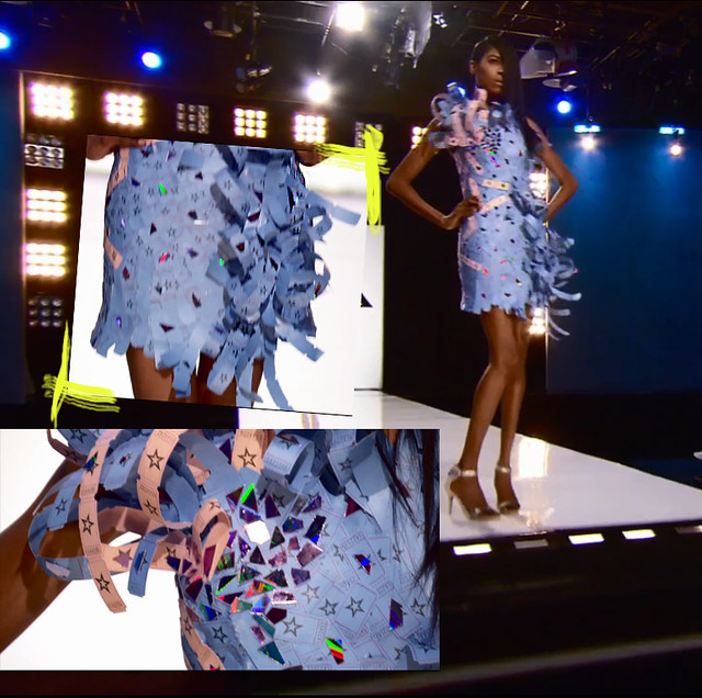
Kini: 8/10
Exciting, Electrifying, Eclectic, Playful
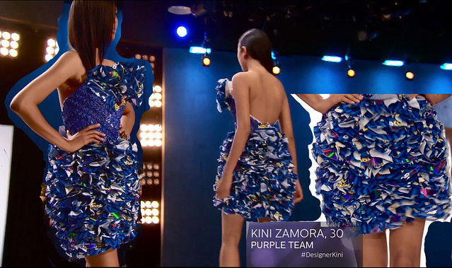
- The bits of CDs in between the inserts gives it an extra and exciting dimension
- Just the right amount of volume
- Almost fabric like! Very wearable yet couture at the same time!
=Very Bubblegum, pink Barbie-princess-Katy Perry. Love the use of colors and pushing dimensions, playing with catching light with the use of shards of CDs. Cohesive with the same color palette and without doubt appealing to the same client.
=23/30
My Top Team: Blue Team 24/30
My Bottom Team: Red Team 10/30
JUDGES PICK:
TOP: SILVER TEAM
- “Really cool.”-Zac
- “Your collection felt like the most original.”-Heidi
=I suppose the Judges loved the team’s tenacity to incorporate many different materials and boldly use them to make something inventive and original, pushing the envelope. Other teams pretty much used the same materials: Film Strips, CDs, Paper etc. and they ran in the different direction than the pack, which paid off. Despite not being the most polished of looks (Purple Team and Blue Teams’ execution were much better), their looks still turned out nice and are the most creative and inventive. Yet again, creativity rule. Moreover, being the UNCONVENTIONAL challenge, the judges certainly favor them for being inventive and using most of the materials, differently and unexpected at that (compared to other designers which used them it an almost similar and expected treatment)
Bottom: RED TEAM
- “Dude, they look all the same.”-Heidi
- “They look like 3 girls out of a music video.”-Heidi
=Pretty much agree all of the judges critiques. Flat out horrible, boring and one note. As stand alone designs, they are equally bad in my opinion.
Judges Verdict
Amanda wins this team-unconventional challenge! I suppose her past experience really was the card that gave her this win, and she did drive the team. However, I still think Kristine’s design was slightly better and unorthodox in a good way (Zac seem to love her design, ’em floating marquee letters). Should Amanda had more time to add more material, then yeah, I would say that is a fair win.
Auf to Carrie. Well, I found both Hernan AND Carrie’s design equally bad. However, Hernan’s was better executed and there was at least a bit more designing and effort on Hernan’s (although I think it was bad designing.) I would have booted them both really, one for just playing follow-the-leader which resulted in a boring mess; the latter for coming up with a design which is not all that good even though it was what he envisioned and wanted since the beginning. So much for “I have worked with many designers before”, Hernan. Such lies.
Do you agree with the judges decision? Do you think the judges logic and laws for judging unconventional challenges are off the point? Did you think Angela deserved to be called out and shunned for her design? Did you think Sandhya was the weakling? Which was your favorite team? Which look was your favorite?
The Fashion or Drama, do comment and tell me what you think! 😉
Auf wiedersehen! Till the next episode!
By,
Summer.
